RJI student staffer helps public broadcasting network inform voters with interactive map

This summer, Missouri School of Journalism graduate student Chioma Obianinwa worked with South Dakota Public Broadcasting (SDPB) to create an interactive map that allows readers to easily find information about candidates in state-level legislative races. Obianinwa completed the project as the student staffer for the Reynolds Journalism Institute’s Innovation Team.
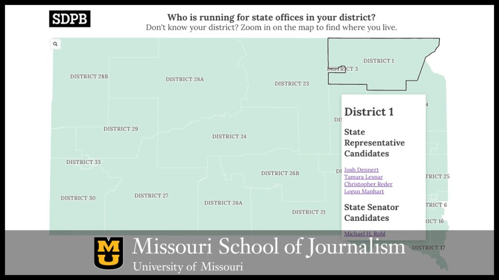
The map allows readers to click on their specific district to see the candidates and their party affiliations, along with hyperlinks that lead to brief articles about the candidates and resources to learn more.
“It’s about visualization, presenting the candidates in a way that is simple so that everyone can be carried along,” Obianinwa said. “A lot of newsrooms are still new to visualization tools, and they are looking for simpler ways, better ways to communicate with the audience, because what causes chaos in the world is lack of understanding. If the candidates have a message they are passing to me and I don’t hear it or understand it, I won’t make informed decisions.”
The emphasis on simplicity also extended to the map’s development. With an eye toward its future use and maintenance, Obianinwa strove to develop an accessible, low-code solution. The result was an easy-to-implement map built on a free template from Flourish, a hub for data visualization resources.
For SDPB, the resulting easy-to-navigate map filled a crucial need.
“In South Dakota, the Secretary of State’s website is very difficult to navigate to find out more about who you’re voting for,” said Cara Hetland, director of journalism content at SDPB. “We want more educated and aware voters, and this is a much simpler resource.”
Qualifications for the task were no issue for Obianinwa: she has nearly two decades of professional broadcast journalism experience, first as a reporter, producer and anchor in Nigeria, then as a senior broadcast journalist for the BBC. Still, the hands-on process of not only helping to develop an important news resource but seeing it through to implementation at SDPB was new to her.
It’s about visualization, presenting the candidates in a way that is simple so that everyone can be carried along. A lot of newsrooms are still new to visualization tools, and they are looking for simpler ways, better ways to communicate with the audience.
Chioma Obianinwa
In fact, she didn’t see herself in the innovation staffer role until she took an emerging tech and innovations course taught by Kat Duncan, director of innovation at RJI. The course surveys everything from AI chatbots to “sonification” — the process of presenting data through sound and the subject of RJI Fellow Auralee Walmer’s current project. Sonification’s better-known cousin, data visualization, caught Obianinwa’s attention.
“At the BBC, there was a department that was doing the [visualization work] I saw in Kat’s class, and I would say, I can’t do what you guys are doing,” Obianinwa said. “They would tell me, ‘well, we’re doing it for you.’ But I never took it serious until Kat looked at me and said, ‘now you’re going to learn it.’ I’m so glad this opportunity came my way.”
Now, working with Emily Lytle, RJI’s Innovation in Focus editor, Obianinwa has been able to apply those lessons learned to a real-world project. At the same time, her professional experience has allowed her to enrich the project with a holistic understanding of audience engagement.
“When we were meeting with SDPB, Chioma was able to think about the fact that, ultimately, we want people to come to the website,” Lytle said. “She’s thinking about the whole audience journey, not just, ‘we’re going to create a map.’”
An important priority at RJI is ensuring that the wider industry can benefit even from experimentation done for a specific newsroom, and this project was no exception: Obianinwa’s articles for RJI’s Innovation in Focus series break down insights gained from the experience so that other news organizations can replicate and improve on the interactive map.
The map will also be of ongoing use to SDPB; Hetland said that due to South Dakota’s heavy use of ballot initiatives and other forms of direct citizen participation in the legislative and electoral process, a similar resource that can more directly incorporate community issues would be useful. To that end, the current interactive map will provide a useful framework for future iterations and experimentation.
Indeed, Lytle expects that framework to help support a variety of solutions to an issue that is far bigger than any one newsroom.
“A lot of people are thinking about how we can make election and voter guides more accessible,” Lytle said. “How do you reach the more politically engaged folks and also the people who are not engaged with every last piece of news around the election? Whether it’s through maps, interactive games or even election guides that are more responsive to the community, we want to help make that happen.”
Updated: August 30, 2024