New Vox Magazine Design Offers Fresh New Look for Columbia Readers
Three Master’s Students Guide the Research, Content and Design Process
By Rebecca Dell
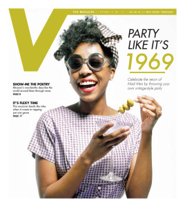
Columbia, Mo. (April 18, 2014) — A live band, giveaways and food from the Ozark Mountain Biscuit Co. celebrated a fresh new look for the print and iPad platforms of Vox Magazine. Vox, a city magazine, covers arts, culture and people and provides tips, trends and reviews to community members.

Missouri School of Journalism faculty, students and staff gathered in Lee Hills Hall April 10 to ring in the latest iteration of the magazine – the first redesign since 2009. Members of the Columbia community, including representatives from The District, Cumulus Media and Veterans United, joined the festivities.
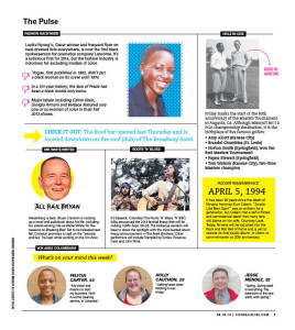
The tabloid-style weekly now sports a sweeping V across its cover, replacing the old Vox logo. Other new features include:
- A new calendar format. Entries are more succinct so more events can fit, allowing Vox to tell Columbians about more events.
- A new front-of-book section called The Pulse. This offers short news bits and allows student editors to practice pitching and writing on deadline.
- A bold color palette with more white space.
- A larger font. Readers said the text was too small, so the staff bumped it up.
- Heavier, brighter paper.
A new website is also in the works, said Associate Professor and Vox Digital Director Sara Shipley Hiles. The new site, which will incorporate the current Vox site and the VoxTalk blog, will be available by June.
The process of redesigning the magazine required brainstorms and research.
“Part of it was trying to figure out some things to solve,” said Jennifer Rowe, the chair of the magazine journalism faculty and executive editor at Vox. “Some of it was looking at what the current magazine had that we thought was either problematic or dated, things that needed to be freshened up for the readers.”

Students and faculty spent about four months working together to research best practices and reader interests before making changes.
Faculty members who supervised the redesign include Rowe; Heather Lamb, assistant professor and editorial director at Vox; Erica Mendez Babcock, assistant professor and design editor at the Columbia Missourian; and John Fennell, associate professor.
Three master’s students took responsibility for the labor-intensive project, working closely with faculty on all aspects.
Vox Editor Caroline Feeney focused on the content angle and researched award-winning redesigns done by other city or regional magazines to find what could work best for Vox. Managing Editor Megan Madden used a reader survey to examine what content people in Columbia would want to see. Creative Director Libby Burns researched and led the visual side of the redesign as her master’s project.
“We wanted something that breathed more visually and gave more room to the stories and added a lot more white space,” Burns said.
Coursework in magazine editing and design as well as experience with the publication prepared the graduate students for the work. Feeney was previously the music editor at Vox, Madden spent the fall semester as the editor, and Burns had already worked as art director. Vox staffing allows students to rotate into different positions every semester.
“We weren’t having to drive the process,” Lamb said of the faculty’s role. “We were there, really, to provide counsel and feedback.”
Now the next round of students will work to continue to fine-tune the current product.
“In the magazine world, you should be constantly redesigning and rethinking,” Lamb said.
Updated: July 24, 2020