Cleaner, Brighter, Easier to Navigate: Vox Magazine Website Redesign Culminates 3 Years of Work
Project Allows Students to Learn New Technologies and How to Better Engage Readers
By Rebecca Dell
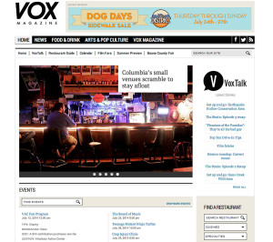
Columbia, Mo. (July 29, 2014) — On the new homepage of VoxMagazine.com, you might decide to click one of the photos, taking you to a story about snarky T-shirt slogans. As you scroll down the page, lined with clean white margins, a “Cover Song Countdown” headline might catch your attention, taking you to the VoxTalk blog. After watching a few embedded music videos, you might scroll up and click on “Calendar” to search for something fun to do. Next thing you know, you’re off exploring Columbia, keeping an eye out for someone wearing one of those snarky shirts.

Greater accessibility to the magazine’s current and trendy content is what the recently launched VoxMagazine.com website offers readers.
Vox caters to Columbia’s vibrant community, and like all of the Missouri School of Journalism’s outlets, it uses the Missouri Method to give magazine and design students hands-on experience. The magazine, which has a circulation of around 10,000, is offered to Columbians for free every Thursday online, on an iPad and in print.
The new site design gives users gateways to other content in hopes of keeping them on the site, according to Kristin Kellogg, BJ ’07, MA ’09. Kellogg served as an adjunct instructor for Vox before joining Atlanta Magazine, where she is now the senior art director.
“One main goal was just to get the site to look more in line with the expectations of Vox’s audience and make it look like a modern site,” Kellogg said. The former site, now archive.voxmagazine.com, was created in 2006.
The new site is the result of three years of planning, redesigning, revamping and reorganizing the existing content. Highlights include:
- A fully-integrated VoxTalk blog, meaning there’s no longer a need to jump between two different pages for blog and website content.
- The restaurant guide can be searched for price range, food type and specialty.
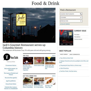
- The navigation bar is designed around Vox’s specialties: News, Arts & Pop Culture and Food & Drink.
- The homepage features a rotating gallery to better display photography and top stories.
- The calendar is sortable by price, location and type of event.
A team of Missouri Journalism students loaded stories and photos onto the site once the WordPress content management system was developed. Master’s students Laura Heck and Justin Paprocki, along with undergraduates Beth Steffens, Becky Neems and Janelle Pfeifer, spent most of the spring semester fine-tuning and populating the site. Magazine faculty professors Jennifer Rowe, Heather Lamb and Sara Shipley Hiles, as well as Columbia Missourian Director of Digital Development Rob Weir, oversaw their work.
Heck, the current editor in chief, had already worked as a department editor, VoxTalk editor and digital managing editor at Vox. Her familiarity with the magazine and its audience helped her think about the readers’ needs as the team worked on the new site.
“A lot of what we did wasn’t just the hands-on nitty-gritty stuff, but it was a lot more thinking about, OK, what’s our strategy going to be?” Heck said. “Now that we have this beautiful new website, how are we going to use it, and how’s it going to change the way that we do things?”

The WordPress content management system (CMS), Kellogg said, is one of the finest points of the new website.
“I worked with the Vox CMS both as a student and as an instructor, and I taught many semesters of Vox-ers how to use it, so I was intimately aware of some of the challenges and clunkiness of the previous system,” Kellogg said. “Anyone who has every had to manually enter in the movie times in Django (the old CMS) would appreciate this (WordPress).”
The WordPress platform also allows for some flexibility, Weir said, when students or faculty want to try something new with the site. After all, the magazine exists both for serve readers and allow students to learn and innovate.
“Part of our mission statement is to always be something new, something useful, and something provocative,” Heck said. “And I think that our website totally accomplishes that.”
The new VoxMagazine.com is updated daily with new content. Email vox@missouri.edu with questions or comments.
Updated: July 27, 2020
Related Stories
Expand All Collapse All-
- Dec 07, 2016 Fall 2016 @Mizzou: Magazine Program Gives Students Creative Freedom
- Jun 06, 2016 Vox Magazine Wins 3 National Society of Professional Journalists Awards
- May 17, 2016 Jennifer Rowe Wins the O.O. McIntyre Professorship for Teaching Excellence
- May 16, 2016 Meredith Corp. Executives Praise Students' 2 New Magazines Prototypes
- Mar 31, 2016 Magazine Club Travels to New York for Annual Networking Trip
-
- Oct 13, 2014 Vox Magazine Students Use Digital Tools to Catch Vibe of Roots 'N' Blues 'N' BBQ Festival
- Jul 29, 2014 Cleaner, Brighter, Easier to Navigate: Vox Magazine Website Redesign Culminates 3 Years of Work
- Jul 28, 2014 Vox Magazine Wins 8 Awards in National Student Magazine Contest
- May 08, 2014 Vox and Magazine Journalism Students Earn 3 SPJ National Mark of Excellence Awards for Quality Journalism
- Apr 18, 2014 New Vox Magazine Design Offers Fresh New Look for Columbia Readers
- Jan 27, 2014 Students Publish Columbia's Little-Known Secrets in Vox Magazine
-
- Dec 18, 2012 Five Missouri Journalism Classes Produce Multiplatform Package of Stories for Vox Magazine
- Jul 25, 2012 Vox and Magazine Journalism Students Win Seven Awards in National Competition
- Jun 12, 2012 New Website Commemorates 150th Anniversary of the Civil War
- May 09, 2012 Missouri Journalism Student Designers Earn Four Awards in National Contest
- Apr 09, 2012 Vox Magazine Earns an Award of Excellence from the Society of News Design
-
- Jun 25, 2004 Magazine Faculty Member Receives Campus Teaching Award
- May 10, 2004 Journalism Students Win 26 Awards, Sweep Infographics at National Design Competition
- Apr 08, 2004 Graduate Student Receives Honorable Mention in National Writing Contest
- Mar 12, 2004 Students Learn First Hand from Magazine Representatives